
Esther Proficz
A coaching brand that feels like a conversation
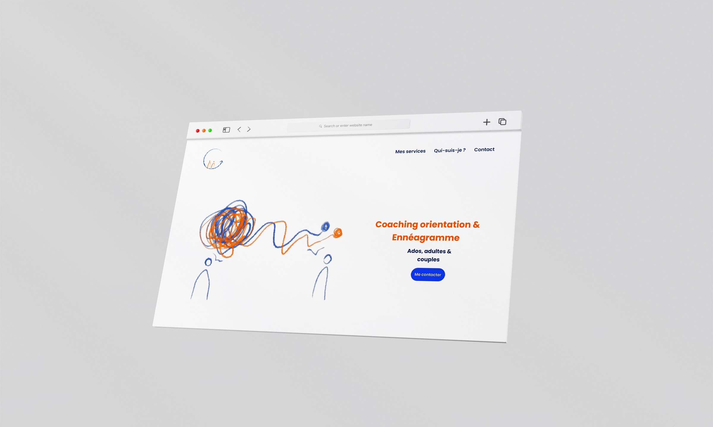
Role
Brand & web designer
Timeline
Dec 2021 to 2022
Place
Brussels, Belgium
Scope
Logo, illustration, UI design
Languages
French
Overview
Career coaching and the Enneagram, for teens and adults
Esther Proficz coaches teenagers facing their first study choice, young adults who no longer recognise themselves in the path they started, and adults thinking about a career change. She also works with the Enneagram and MBTI, alone or with couples.
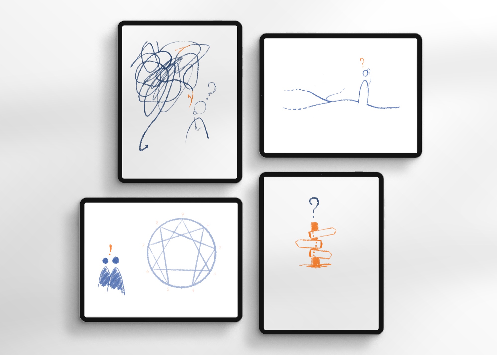
She needed a website and an identity that were hers: not stock photos of signposts, but visuals that explain what it feels like to be lost, and what it feels like to be accompanied out of it.
First version
Where I started, self-taught
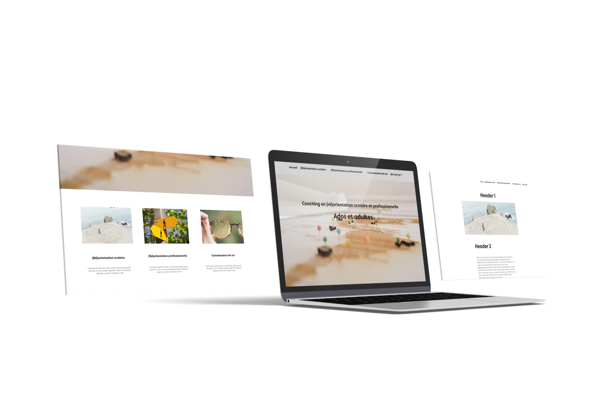
I built the first version in December 2021, while taking my first steps in web design. A few tutorials in, it worked: clear sections for school orientation, career change and self-knowledge.
It also looked like every other coaching site. Stock imagery, no identity, and nothing that said who Esther was or how she works.
The reframe
With new skills, I started again from the brand rather than from the page: a new identity, hand-drawn illustrations and a new format.
Research
Orientation, youth, paths
Online courses, graphic design references, competitor analysis. I needed to know what the landscape looked like before adding to it.
- Coaching and orientation sites tend to lead with credentials and stock photography, and bury the practical details.
- The audience is split: a 16-year-old and a 45-year-old considering a career change need to recognise themselves fast.
- The mood had to be dynamic without shouting: lively colours, not garish ones, and some softness.
The logo
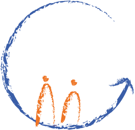
Two figures, the same size
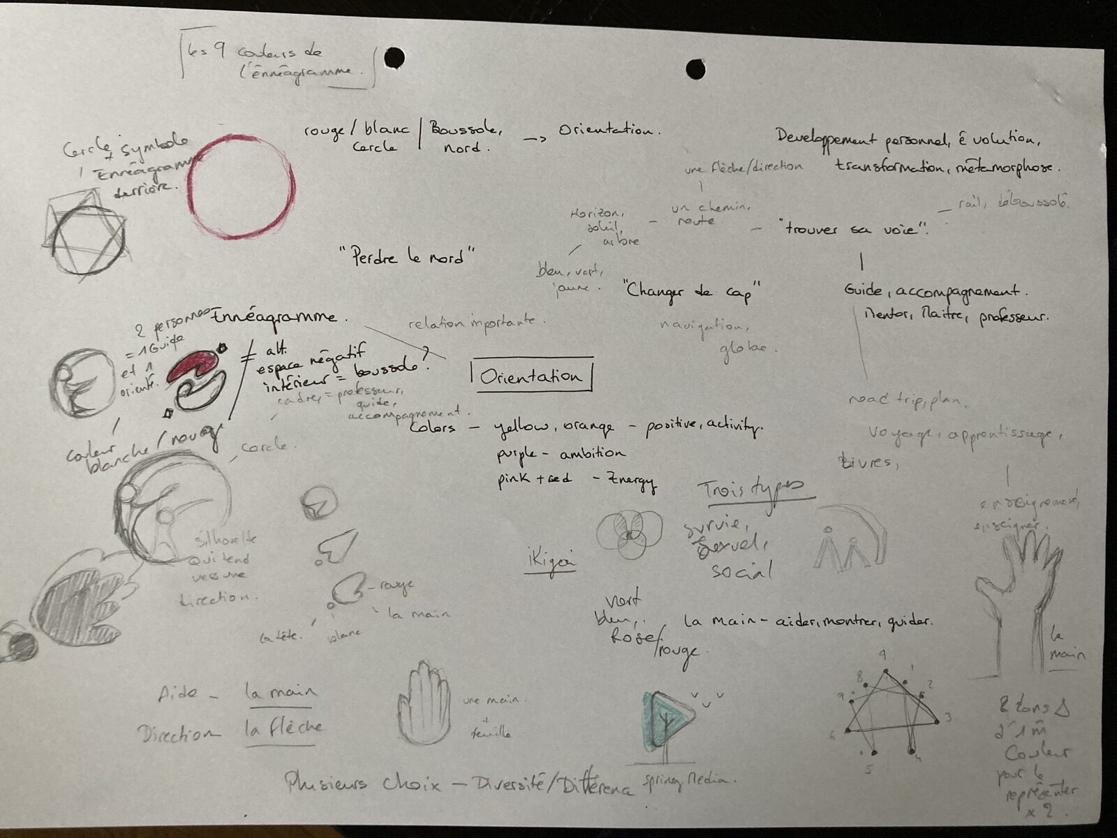
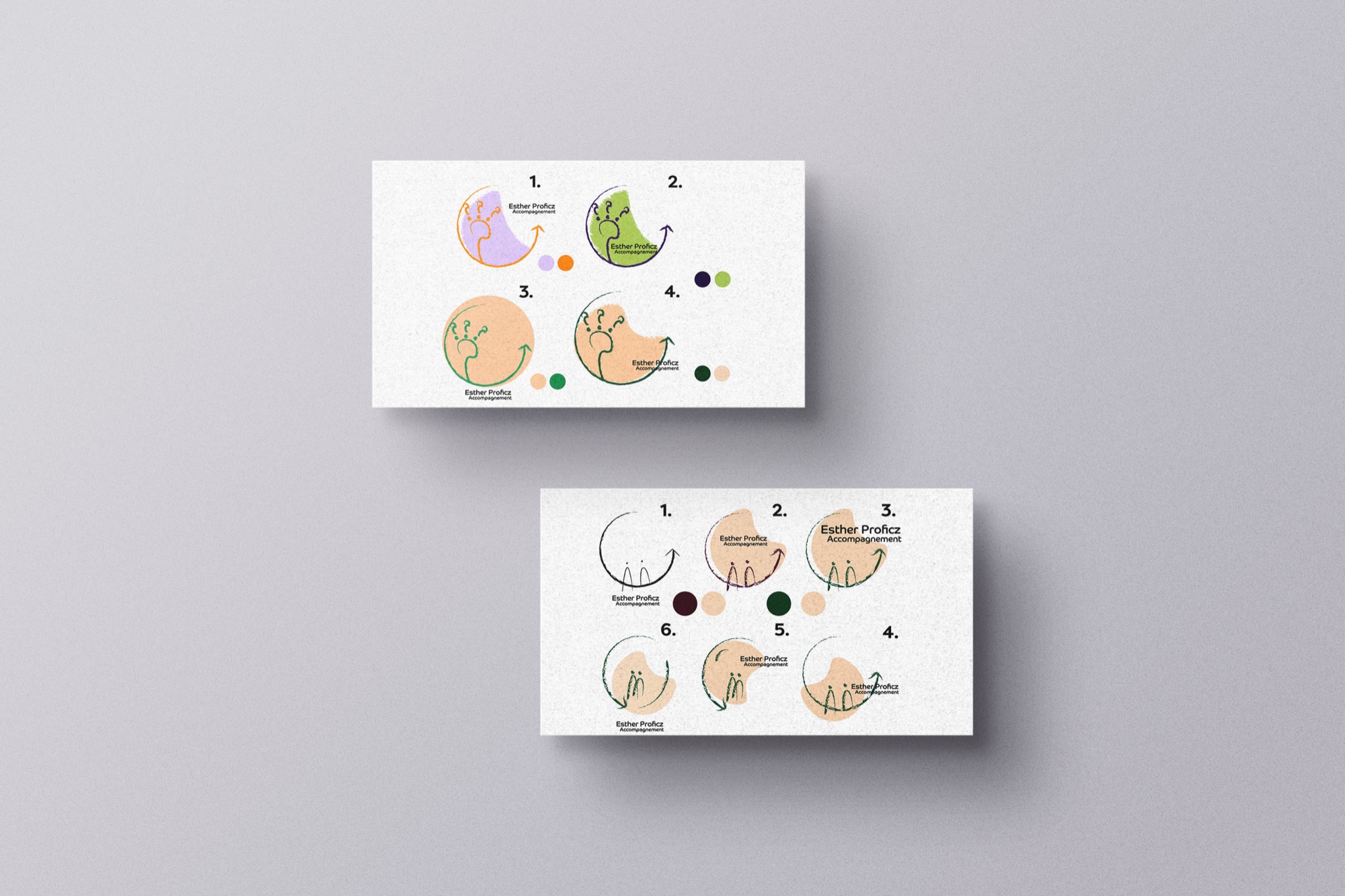
The logo went from sketches to a dozen colour and shape variations before settling on the idea that carries the whole brand.
01
Sketch the idea
Question marks, a path, an arrow that loops back up: the first drawings were about moving from doubt to direction.
02
Simplify
The background shape disappeared. What stayed was the circle and the two figures inside it.
03
Make them equal
Coaching is done by two people. Both figures are the same size, because neither is above the other.
04
Keep the hand
The pencil texture stayed, so the logo sits naturally next to the illustrations.
UI direction
Orange for energy, blue for trust
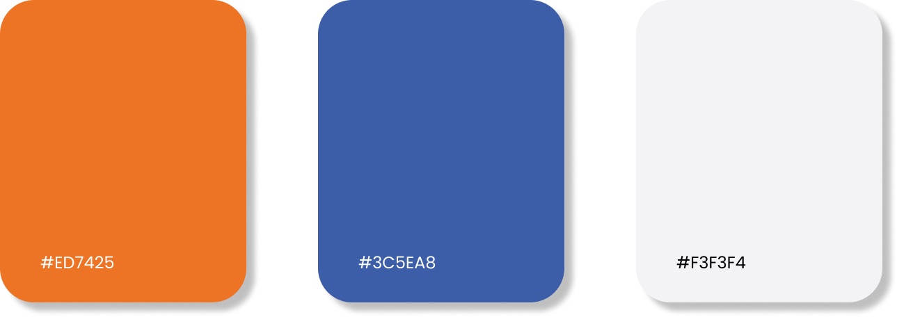
The palette comes straight from the illustrations: a warm orange for headings and calls to action, a calm blue for text and structure, and a soft grey instead of pure white.
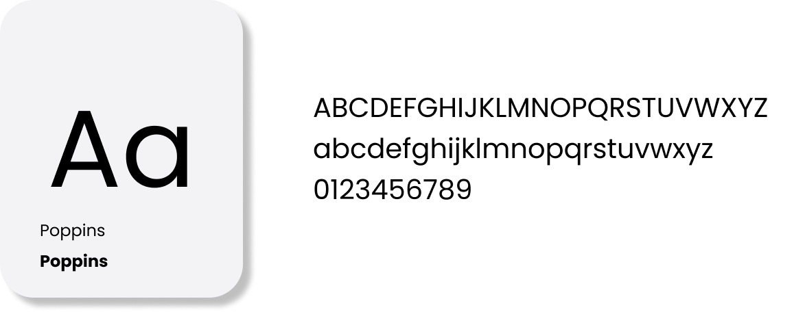
Poppins, in two weights, keeps the type round and friendly without competing with the drawings.
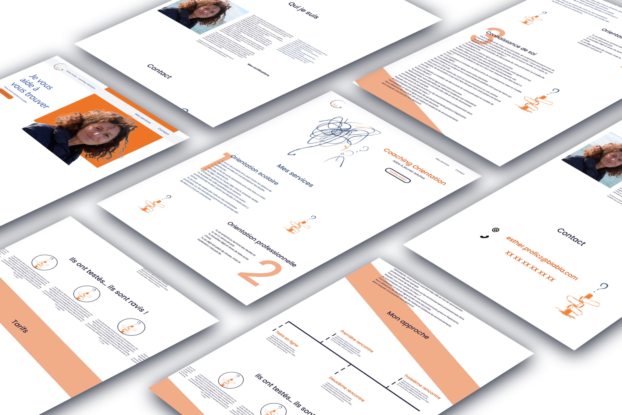
The screens
Where it landed
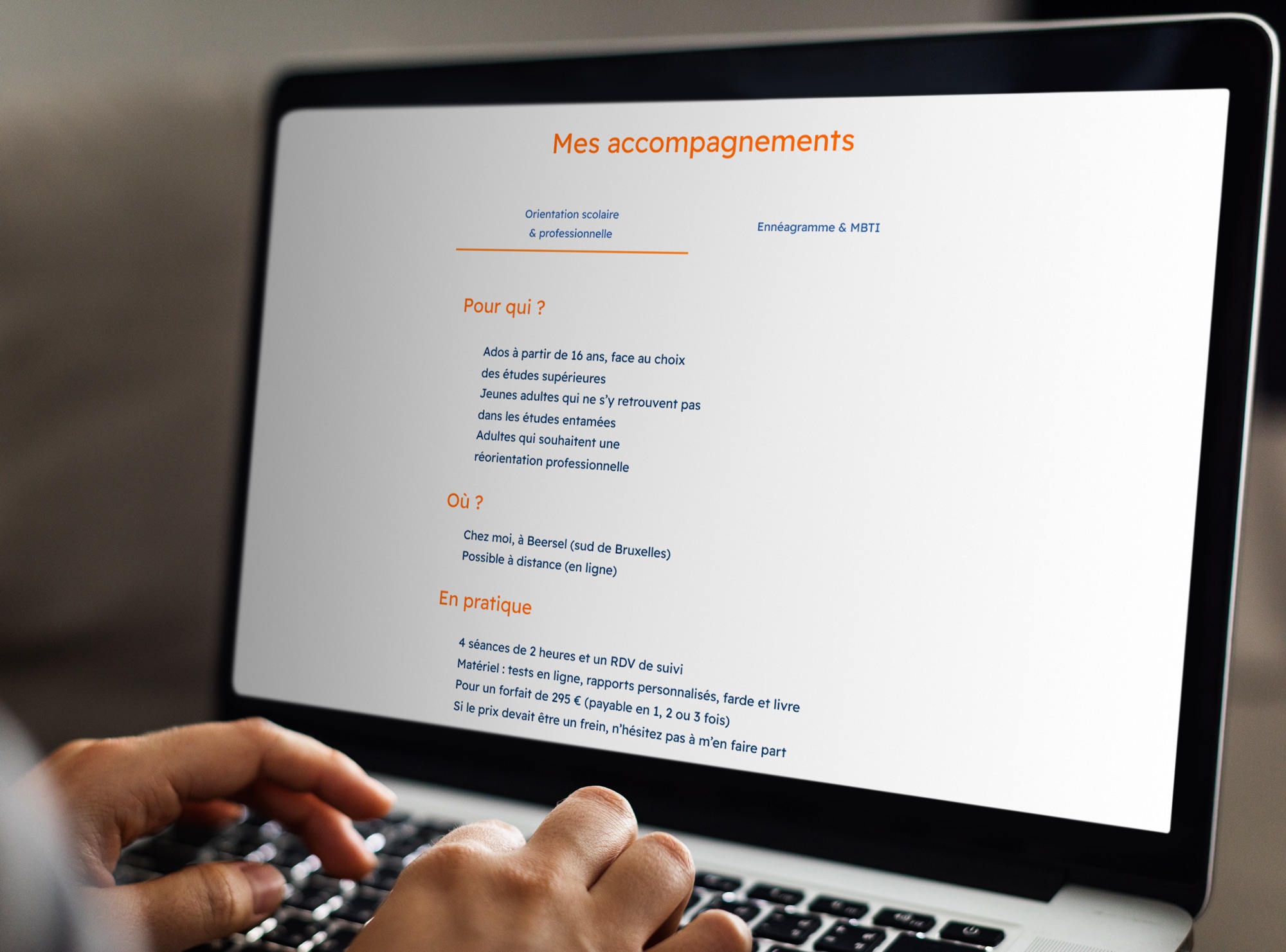
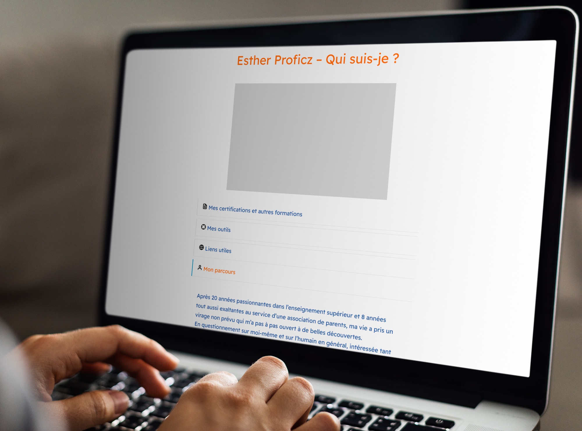
Services are split into tabs, so visitors pick the profile they recognise themselves in before reading anything. Each tab answers the same three questions: for whom, where, and in practice.

Outcome
What changed
2
Versions of the site, from a self-taught first draft to a brand-led redesign.
3
Audiences, teens, adults and couples, each finding their own way in.
1
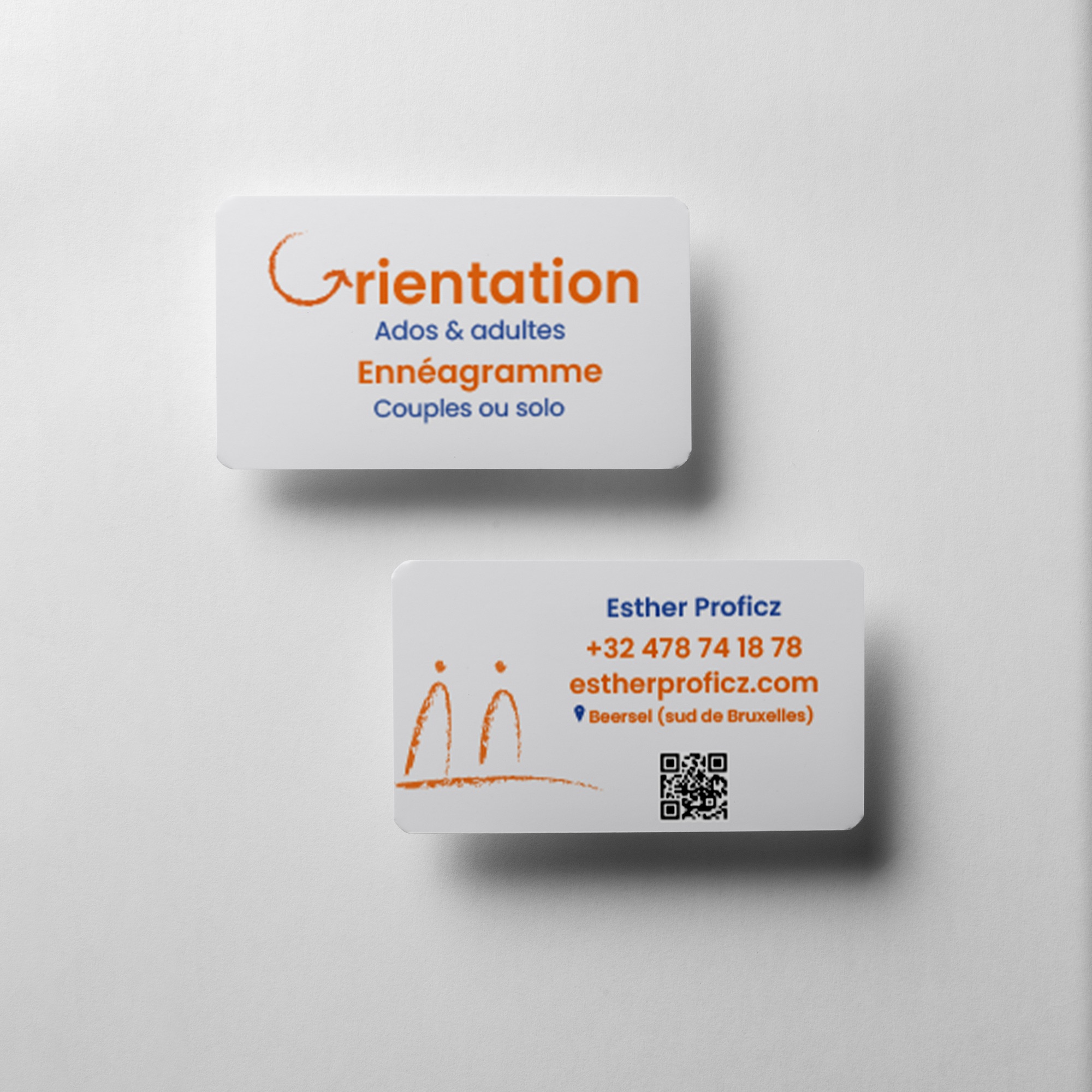
Visual language, shared by the logo, the illustrations, the site and the business cards.
Next case study