
Denti’Cab
Easily book a dentist appointment
Role
UI·X Designer – Writer
Timeline
2024
Place
Bruxelles, Belgium
Scope
UI design, UX Writing
Languages
French
Overview
Improving patient experience
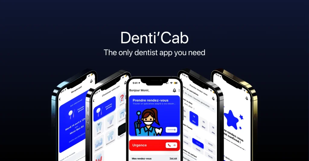
Most dental booking starts with a call during opening hours, which is exactly when you are at work. Denti’Cab starts with the treatment you need and works backwards to a slot.
As this app is a concept, there was no client brief to satisfy and no legacy system to work around. I designed the flows, the interface system and every label in it.
The premise
Booking without knowing
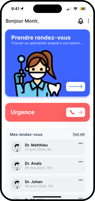
I picked dental care because the friction is specific and everyone recognises it. Rather than design a generic health app, I wrote down the four moments where people give up and designed a screen for each.
- You do not know what your problem is called, so you cannot choose an appointment type.
- You need to cancel and you do not want to be judged for it.
- It is 11pm and something hurts now.
- You have used the service before and should not have to re-explain yourself.
Flow 1 – Treatment
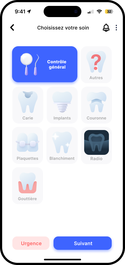
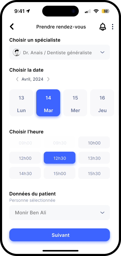
Choosing the right treatment
The selection step is written in symptoms and reasons, not in clinical categories – so anyone can understand it. Choosing the right category can help both the dentist and the patient, as the dentist will understand how much time he’ll need for the chosen treatment.
Flow 2 – Emergency
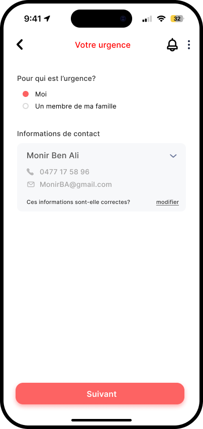
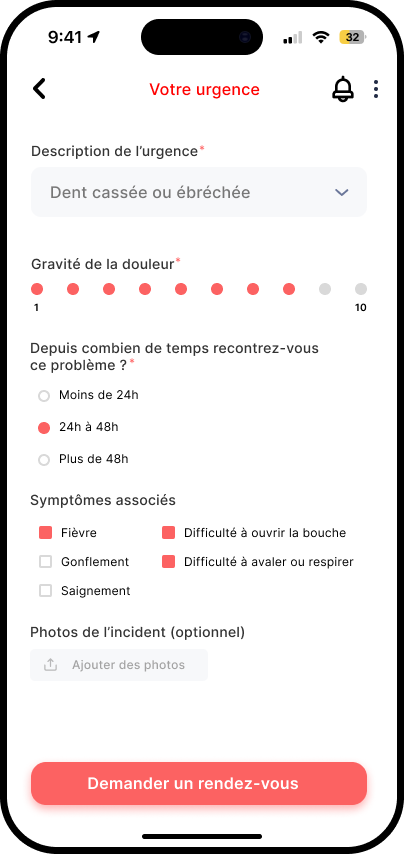
The emergency path
An emergency is the one case where a booking app should stop trying to be an app. No onboarding, no account, no upsell. As pain kicks in and nothing else should matter that getting your appointment et getting treated.
The emergency flow asks one question, shows who is on duty, and gives a route. The copy is short because nobody in pain reads a paragraph.
Flow 3 & 4
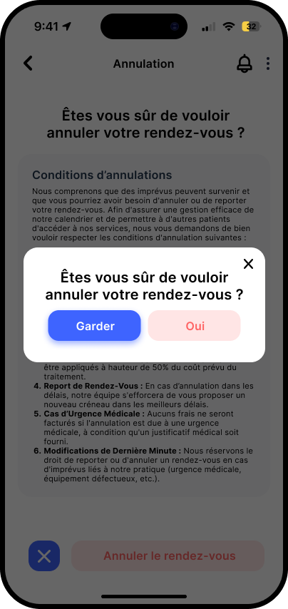
Cancelling, and coming back
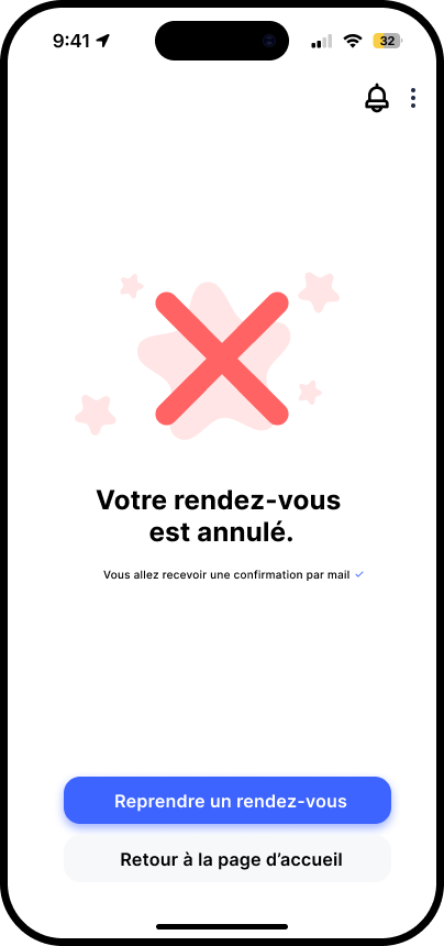
Cancellation is a copy problem more than a UI problem. The screen confirms the change, states the clinic’s notice period as a fact rather than a warning, and offers the next slot in the same view.
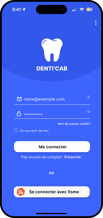
Sign-in stays deliberately small. Returning patients see their history first, so the second booking is two taps shorter than the first.
UI direction
A clinical palette that isn’t cold
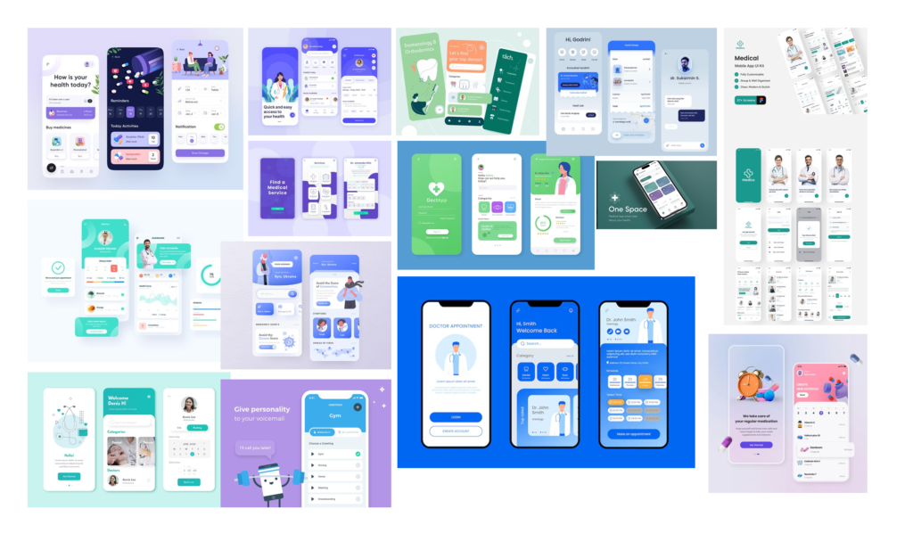
Dental branding defaults to surgical white and hospital blue. I kept the calm but added warmth, as it was important for me that patients would be comfortable using the app whatever is happening to them.
What i took from it
What I learned
I got the opportunity to improve my ux writing skills when writing the microcopy for the app. Content is also design, and a big part of it.
Understanding the customer and their need is must-have to create the best experience. I didn’t have first hand information for this project and I can see how it impacted my work.
Edge cases help understanding the final product and how patient could interact with it on worst case scenarios.
Next case study