
Pgr brodno
Increase customers reservations
Role
UI·X Designer
Timeline
Sep to Dec 2025
Place
Warsaw, Poland
Scope
UX audit, IA, UI design, UX copy
Languages
Polish and English
Overview
Full redesign and booking integration
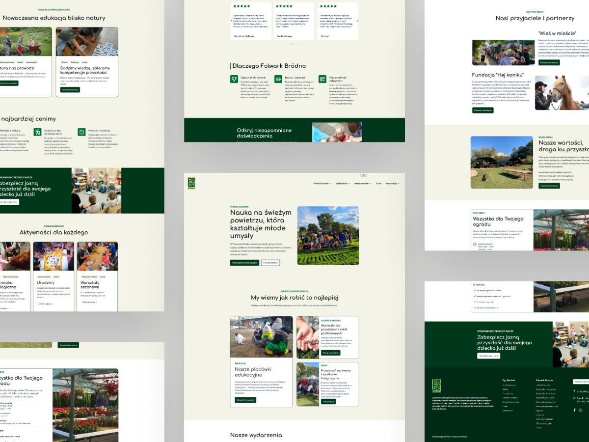
Folwark Bródno is an educational farm in Warsaw. School groups, birthday parties, botanical workshops, holiday camps and a garden centre, all sold through one website that could not explain any of it. I rebuilt the navigation and designed the reservation experience.
The problem
Plenty to offer, no way to find it
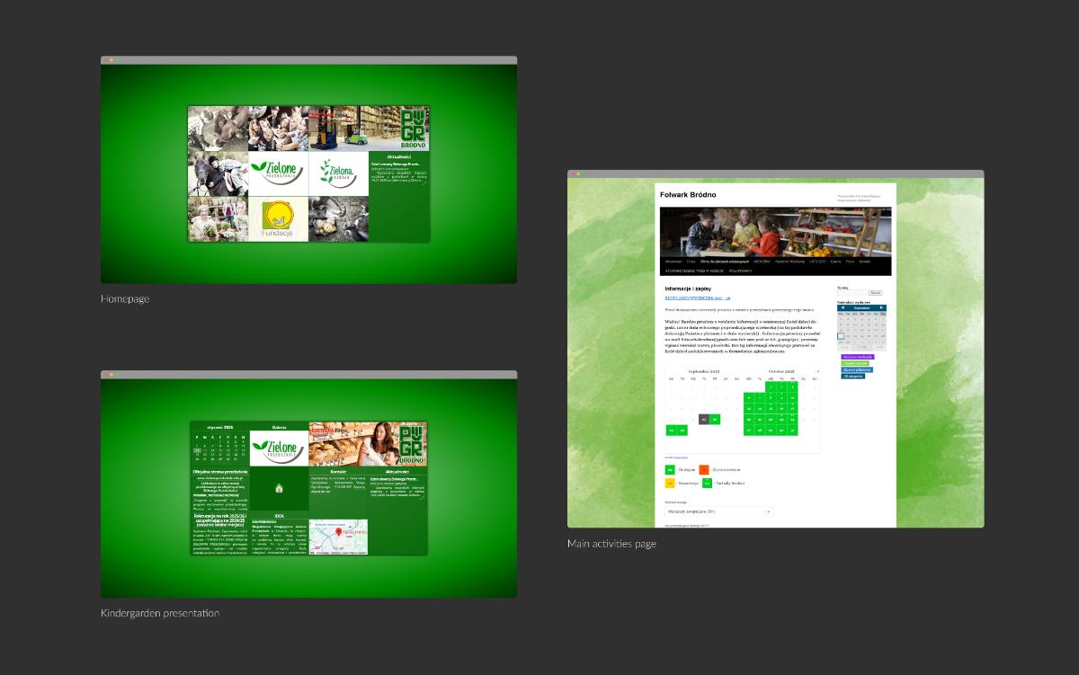
The farm sells experiences, not products. A parent looking for a birthday party, a teacher planning a class trip and a neighbour buying plants all landed on the same page and got the same flat list of links.
Nothing was broken in a way you could screenshot. It was worse than that: everything was one level deep, the offer names did not match what people call these things, and the only booking path was a phone number.
The audit
What the audit turned up
I went through the site page by page against usability, consistency and accessibility, then sorted the findings by how much they cost a visitor.
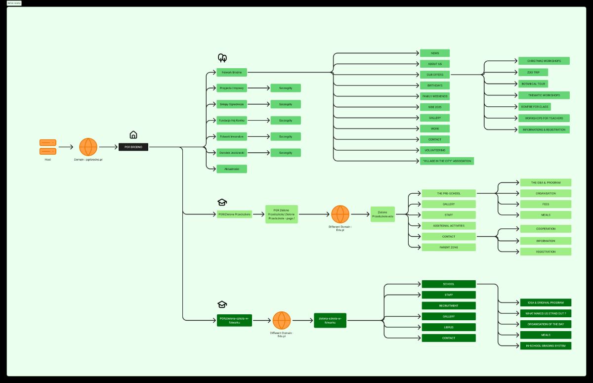
- Five audiences, one undifferentiated menu. Schools, families and garden customers all had to self-sort with no help.
- Activity pages described the farm, not the activity. No duration, no age range, no price, no next step.
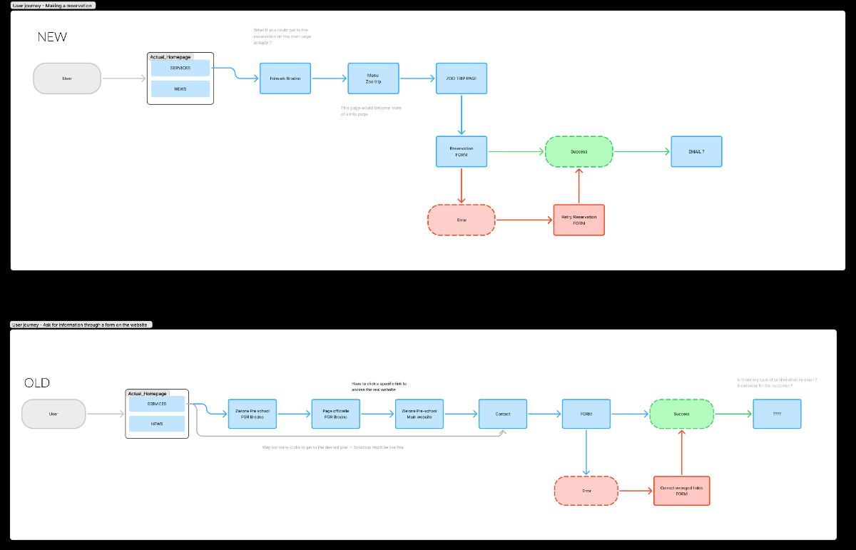
- No reservation path on the site. Every booking went through a call or a message, which the team answered by hand.
- The English version was a partial translation, so switching language dropped you into dead ends.
- Contrast, focus states and link labels failed basic accessibility checks in several places.
The reframe
The site was not a brochure with a booking problem. It was a booking tool that had been written as a brochure.
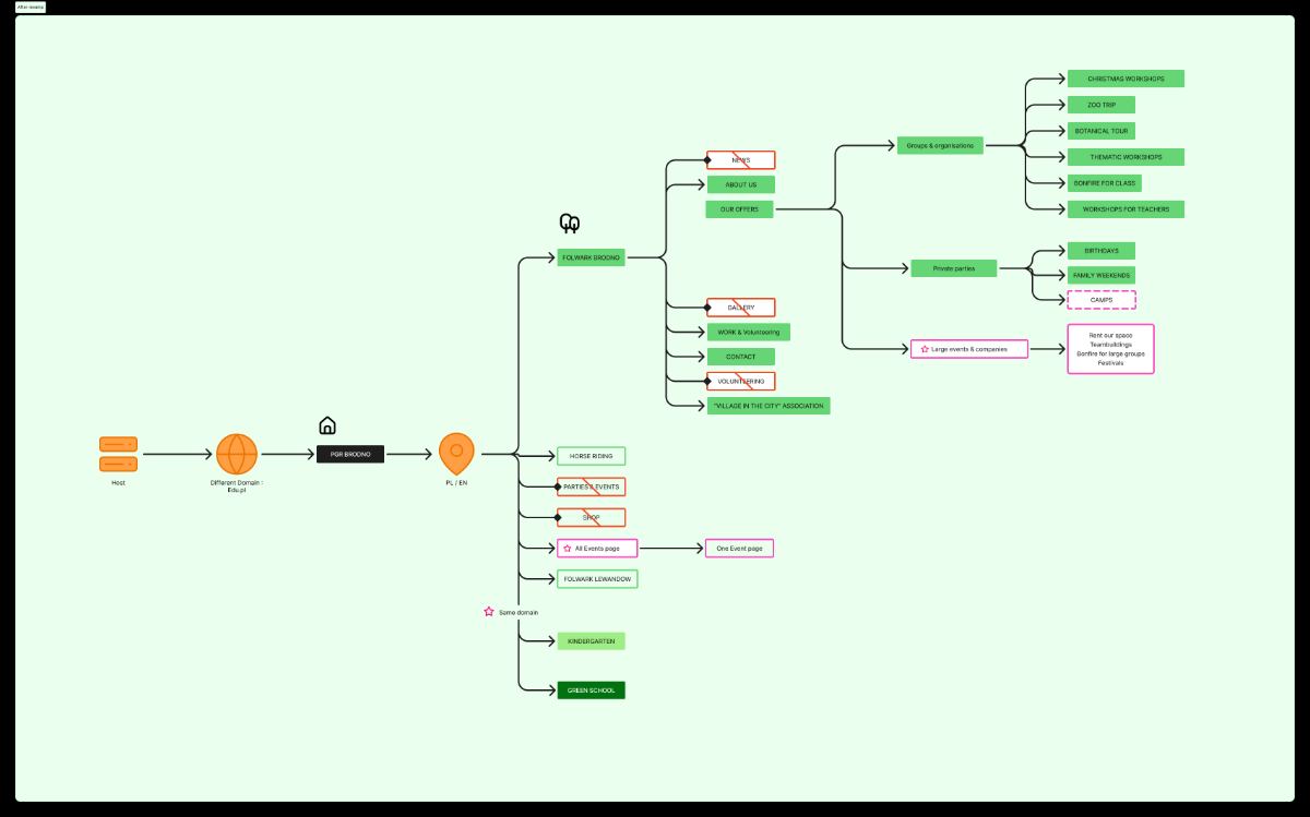
Structure
Fixing the map before the pixels
I regrouped the whole offer around what people come to do, then gave it a mega-menu so the depth is visible without a click.
01
Group by intent
Education, celebrations, seasonal workshops, camps and the garden centre became five clear branches instead of one list.
02
Name things properly
Labels rewritten in the words parents and teachers actually use, in both Polish and English.
03
Show the depth
A mega-menu exposes the second level on hover, so the size of the offer reads immediately.
04
One next step per page
Every activity page ends in the same place: check availability and reserve.
The flow
Registration, drawn before it was designed
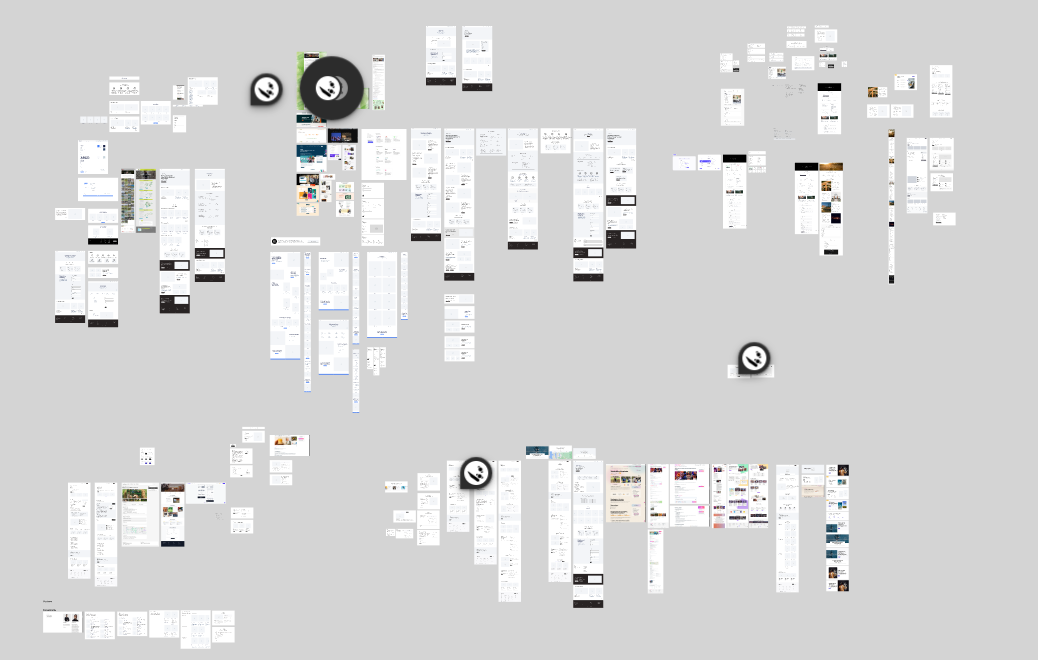
I mapped the registration journey first: entry points, decision points, what the farm needs to collect, and where a group booking differs from a single family.
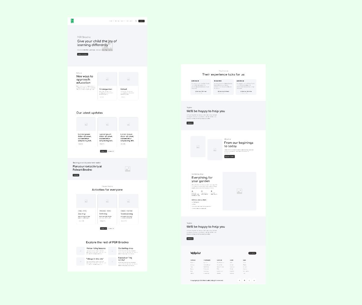
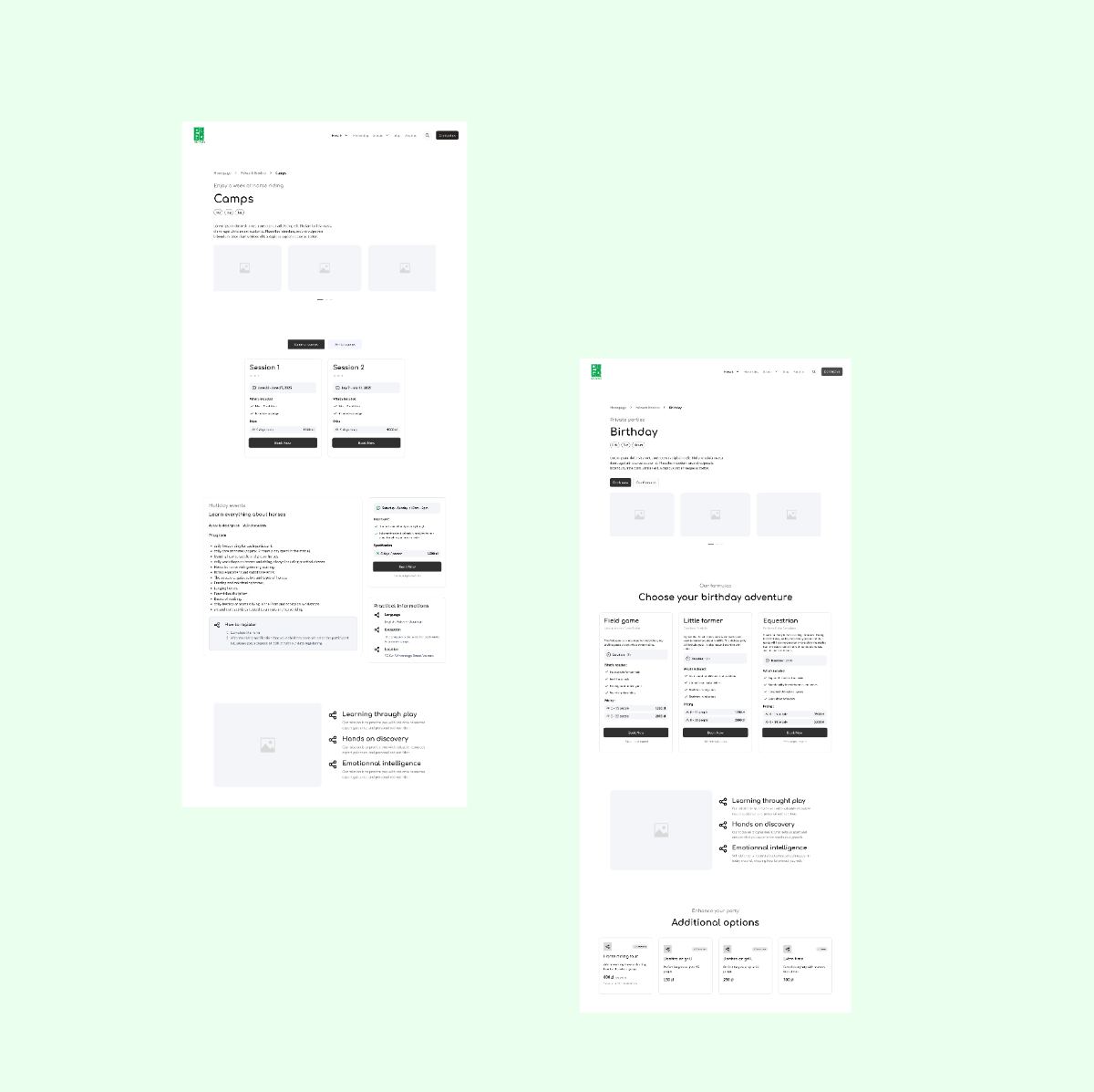
Then low fidelity wireframes for the homepage and the activity page, so the structure could be argued about while it was still cheap to change.
UI direction
Green, but not a leaflet
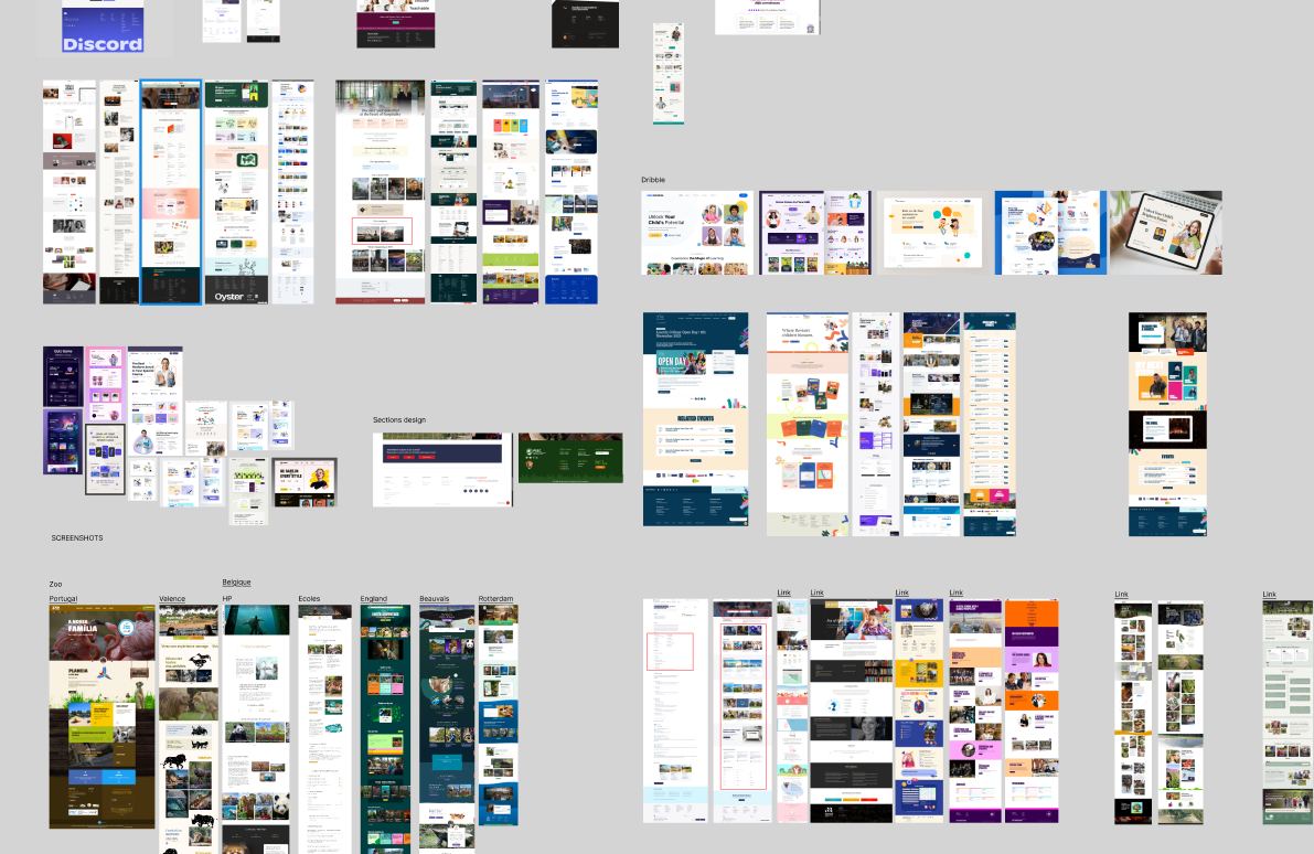
The farm is genuinely green and genuinely rural, so the palette had an obvious starting point. The risk was ending up with a village noticeboard.
I built the board, picked a deep forest green as the structural colour, kept photography large and warm, and used cards with real hierarchy so the pages carry a lot of offer without shouting.
The screens
Where it landed
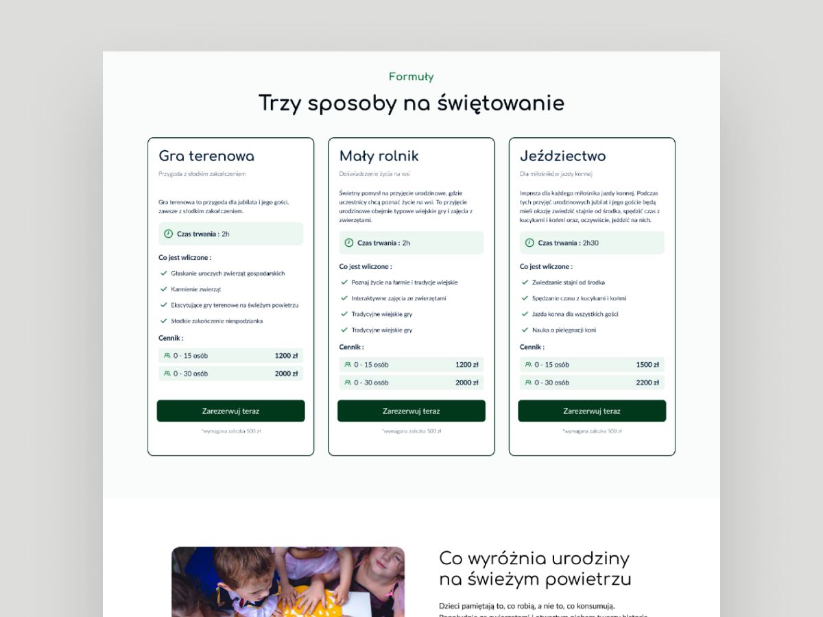
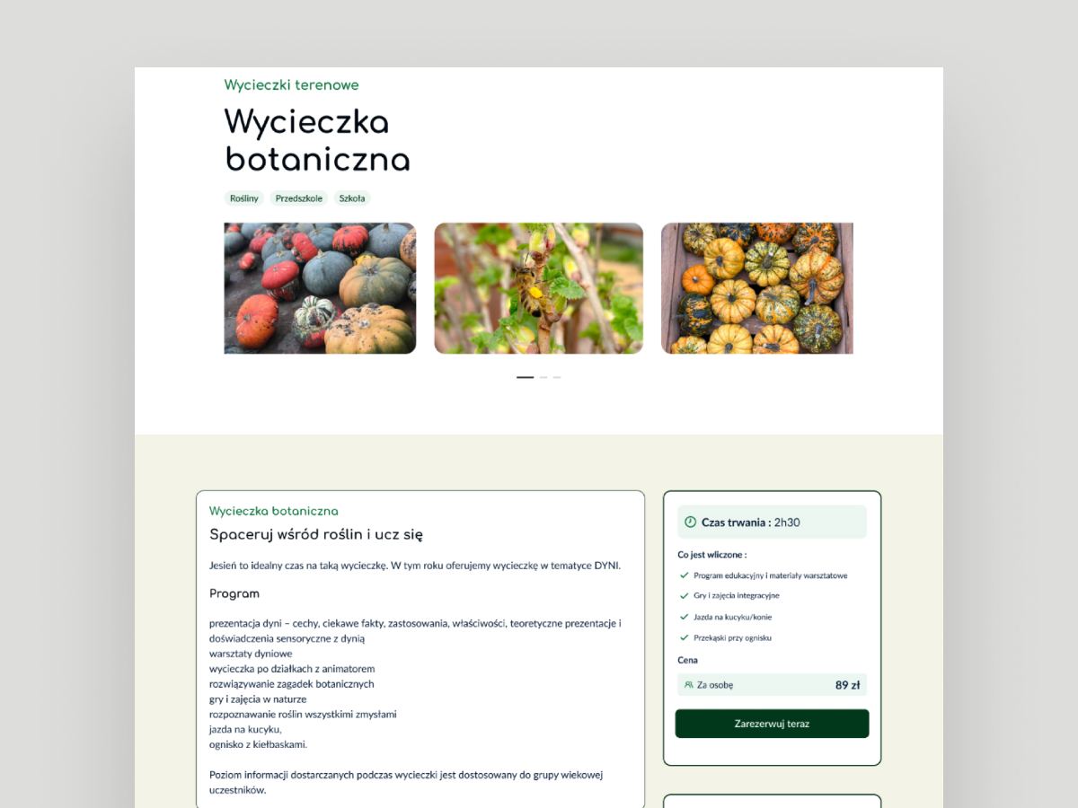
Every activity page now carries the practical facts first, then the story, then one call to action. Copy was written with neuromarketing principles in mind, which mostly means removing hesitation rather than adding pressure.


Outcome
What changed
5
Audience branches in the mega-menu, replacing one flat list of links.
1
Reservation path, reachable from every activity page instead of a phone number.
2
Languages treated as equals, so switching no longer drops you into a dead end.
Next case study