Project name
PGR
Customer
Pgr Brodno – Warsaw, Poland
Role
UX UI Designer & Web Designer
Copywriter
Branding
Results
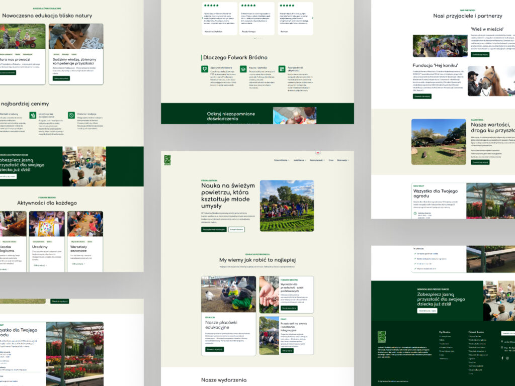
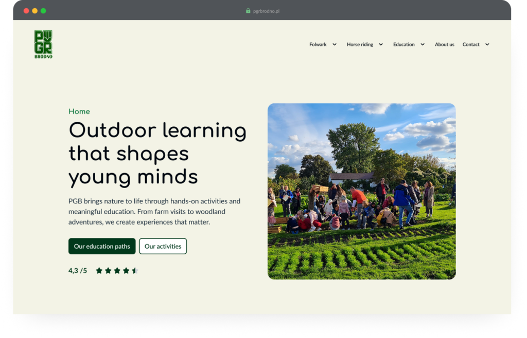
A clear, modern and responsive website
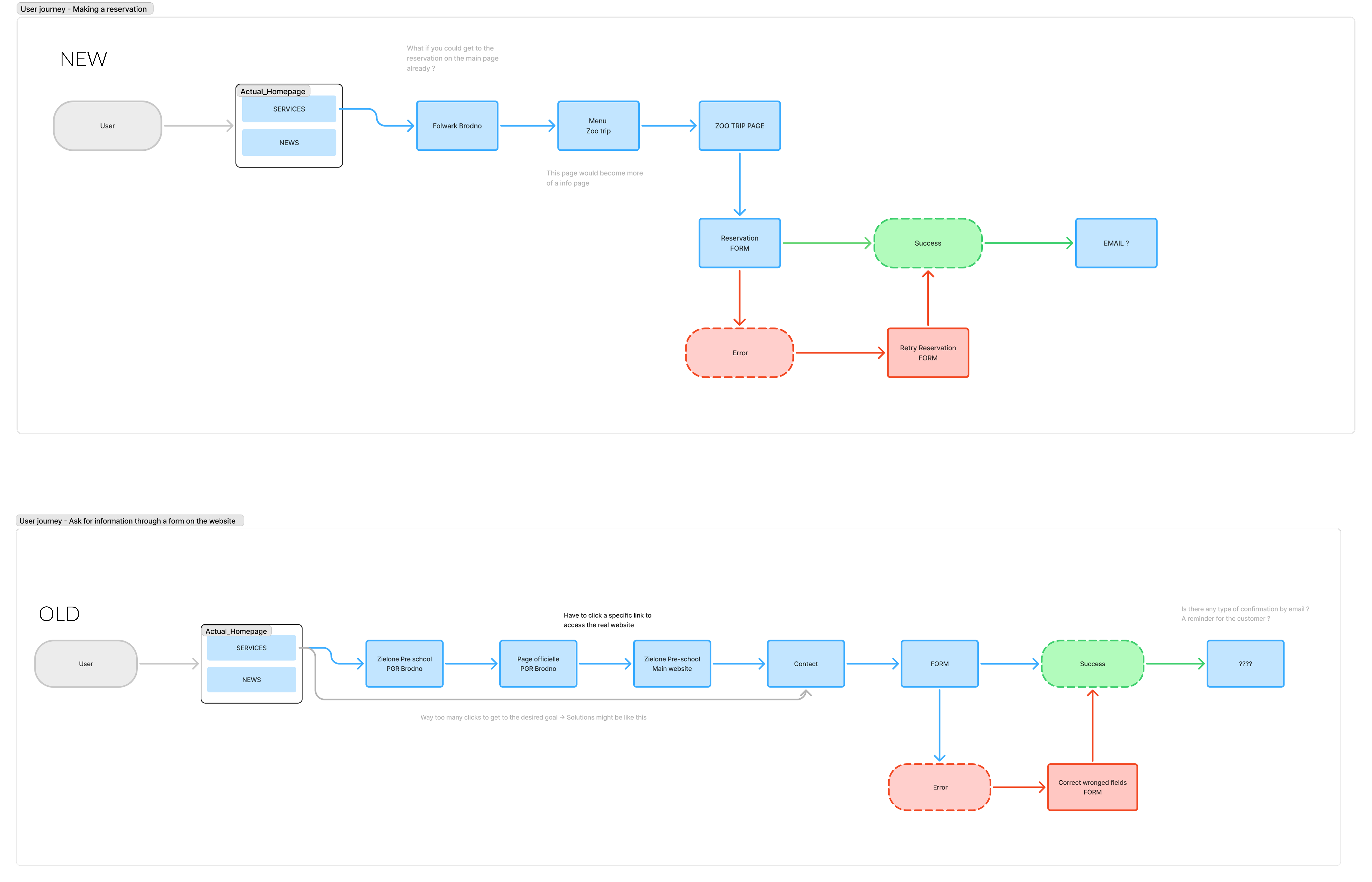
Simplification of users flows, both to get the information they seek and to make a registration.
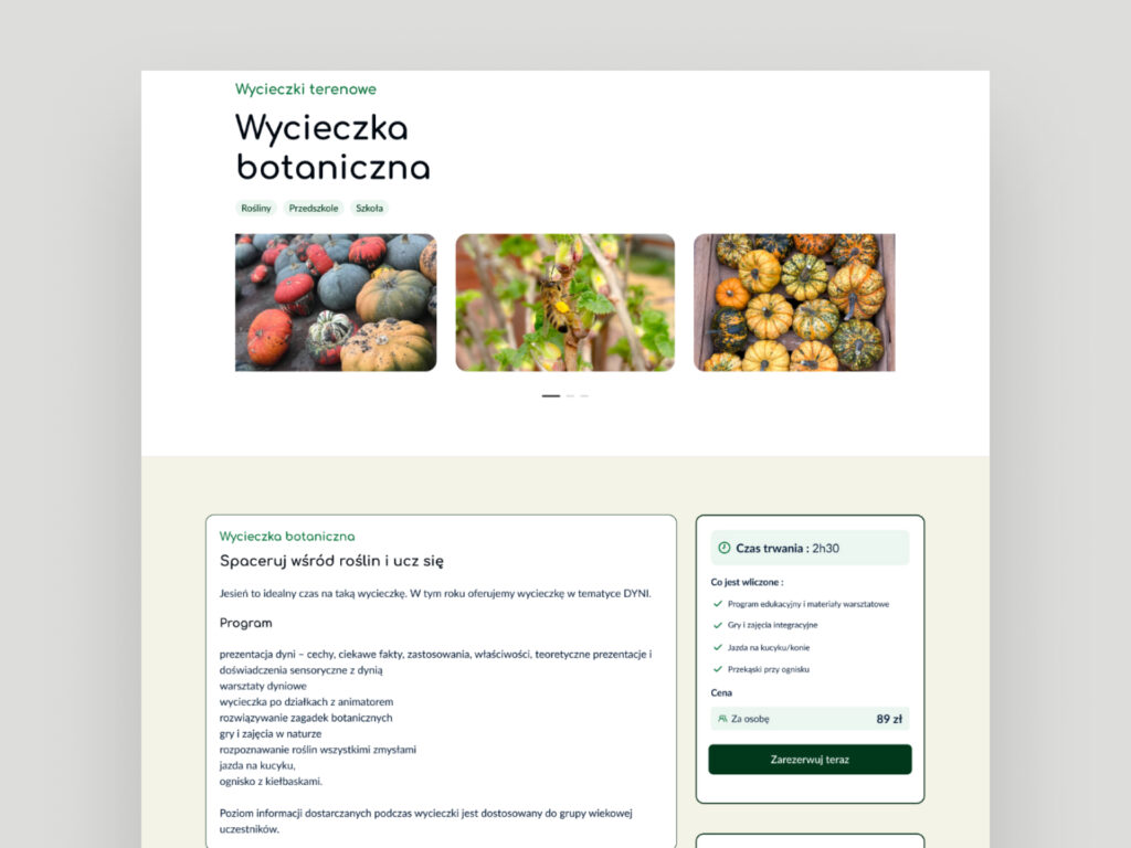
Highlights of the schools programs and activities
Redesigning an educational farm’s digital presence to connect children with nature
Target audience
Families, educational organizations, schools
Localization
English & Polish
Wording challenges
Activities
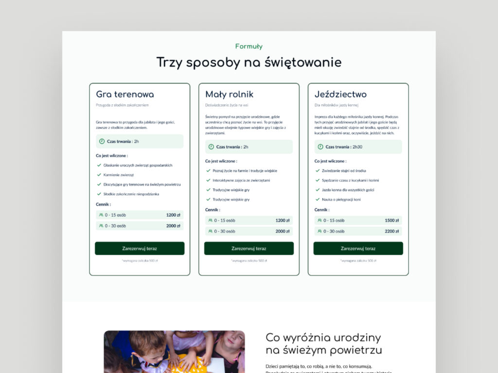
School trips, horse riding, birthday parties, workshops
focus
Animals, botanical workshops, outdoor learning

The old site had given rise to problems, such as a confusing information architecture, which in some places left users from seeing all the information, and chaotic and lengthy user flows to reach a goal.
My process was appropriate to identify all the existing paths and simplify them.
In addition, we needed to create a site map for unnecessary pages and those that needed to be added. The client’s goal was to promote the school programmes (particularly those at the newly opened primary school) without neglecting the various activities they offer for children.
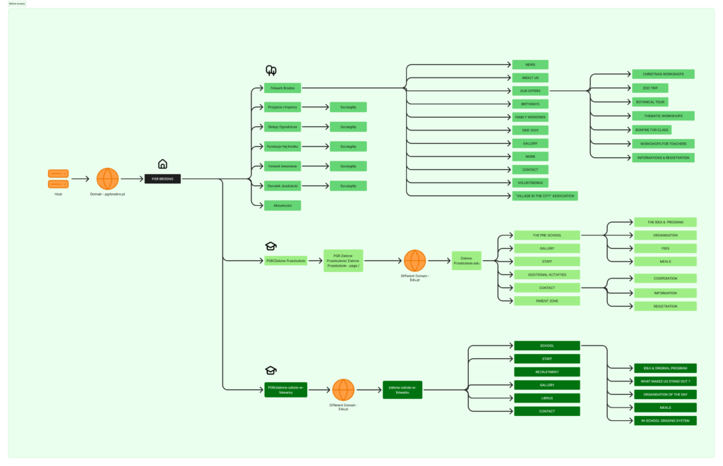
Before revamp
Some user flows shows for example that to get to the kindergarden website, you had to go through 4 pages (clicks), and there was no specific button: The link was lost in the content.
My focus was also on thinking about my client’s long-term vision: in the future, they wanted to centralise all their services on the same site. Currently, the nursery, primary school and their activities each have a different site, and the user journey to reach each one is complex. The aim was to make all this.
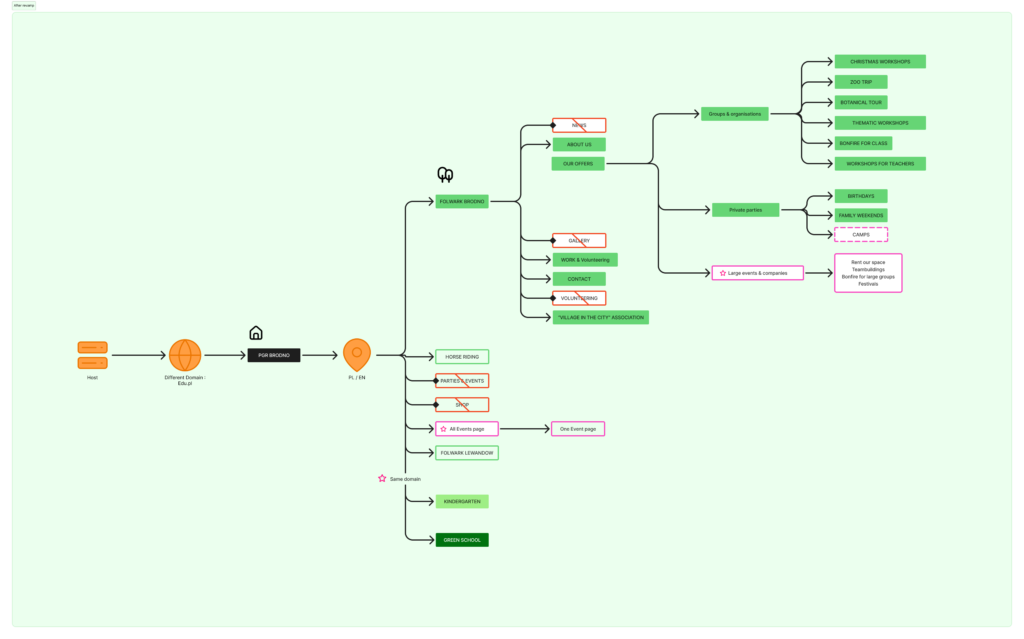
After revamp
It was important to determine which pages should remain, which should be removed, and whether new ones should be added for a specific service.
For example, adding a blogs/articles page, which lists all the company’s events and news, between visitors to quickly view the latest developments.
Distinguishing between ‘contact’ and ‘registration’ pages suspicious cognitive load while physically redirecting users to a specific need.

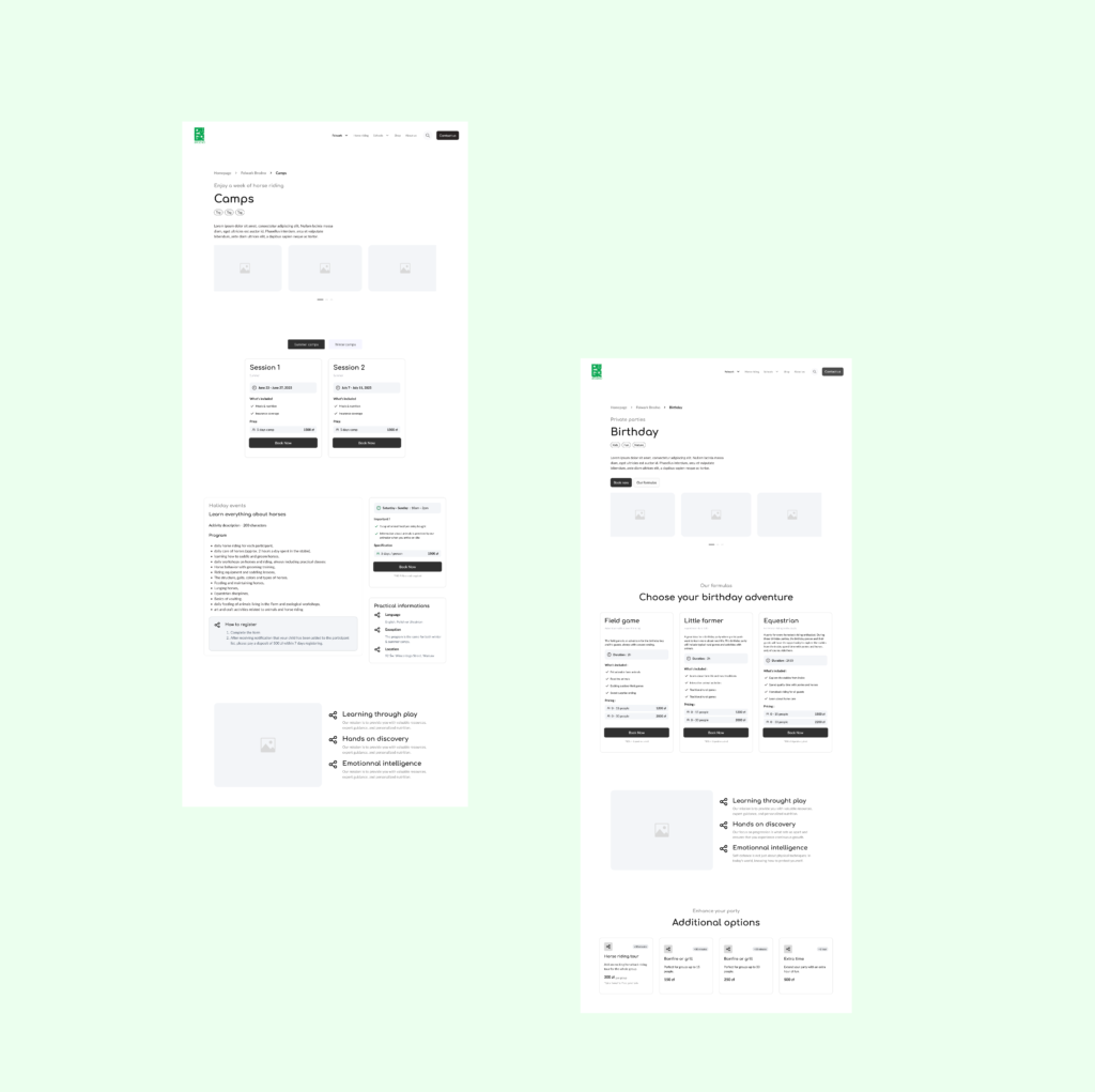
Left: Holiday camps page. Right: Birthday activity page.
